product designer
A further look at the creation of Studio Editor
A further look at the creation of Studio Editor
Visualizing key functionalities
Defining features & how they intertwine
Elements: items that would appear in the published Story (Text, Image, Video, Button, Animation, & Code).
Menus: groups of options relating to the backend of a Story (Editing, Settings, Metadata, & Export).
Global controls: inputs that determine positioning, appearance and element specific controls.
Visualizing key functionalities
Defining features & how they intertwine
Elements: items that would appear in the published Story (Text, Image, Video, Button, Animation, & Code).
Menus: groups of options relating to the backend of a Story (Editing, Settings, Metadata, & Export).
Global controls: inputs that determine positioning, appearance and element specific controls.
Initial concepts
Early conversations & low-fidelity wireframes
Initial concepts were presented to team members across departments to dial in layout. The findings from those reviews are below.
Dual sidebars: reasoning from the marketing team was that this layout felt the most similar to products they had used before. Reasoning from our developers was the lack of programming concerns for a tight turnaround.
Tabular menu: the agreed upon approach to make menus always visible and expand to fill the left sidebar.
Drag and drop: to avoid using a speed dial so that all element categories are visible within the default screen to promote utilization of off-the shelf elements.
Visuals below ↓
Initial concepts
Early conversations & low-fidelity wireframes
Initial concepts were presented to team members across departments to dial in layout. The findings from those reviews are below.
Dual sidebars: reasoning from the marketing team was that this layout felt the most similar to products they had used before. Reasoning from our developers was the lack of programming concerns for a tight turnaround.
Tabular menu: the agreed upon approach to make menus always visible and expand to fill the left sidebar.
Drag and drop: to avoid using a speed dial so that all element categories are visible within the default screen to promote utilization of off-the shelf elements.
Visuals below ↓
Concept voting results
Which concept was preferred the most?
Dual sidebars: 57%
Expandable sidebar: 14%
Tabular menu: 14%
Floating windows: 14%
Other concepts: 0%
Concept voting results
Which concept was preferred the most?
Dual sidebars: 57%
Expandable sidebar: 14%
Tabular menu: 14%
Floating windows: 14%
Other concepts: 0%
Presented concepts



Presented concepts
Refining visuals into a detailed prototype
Visual design
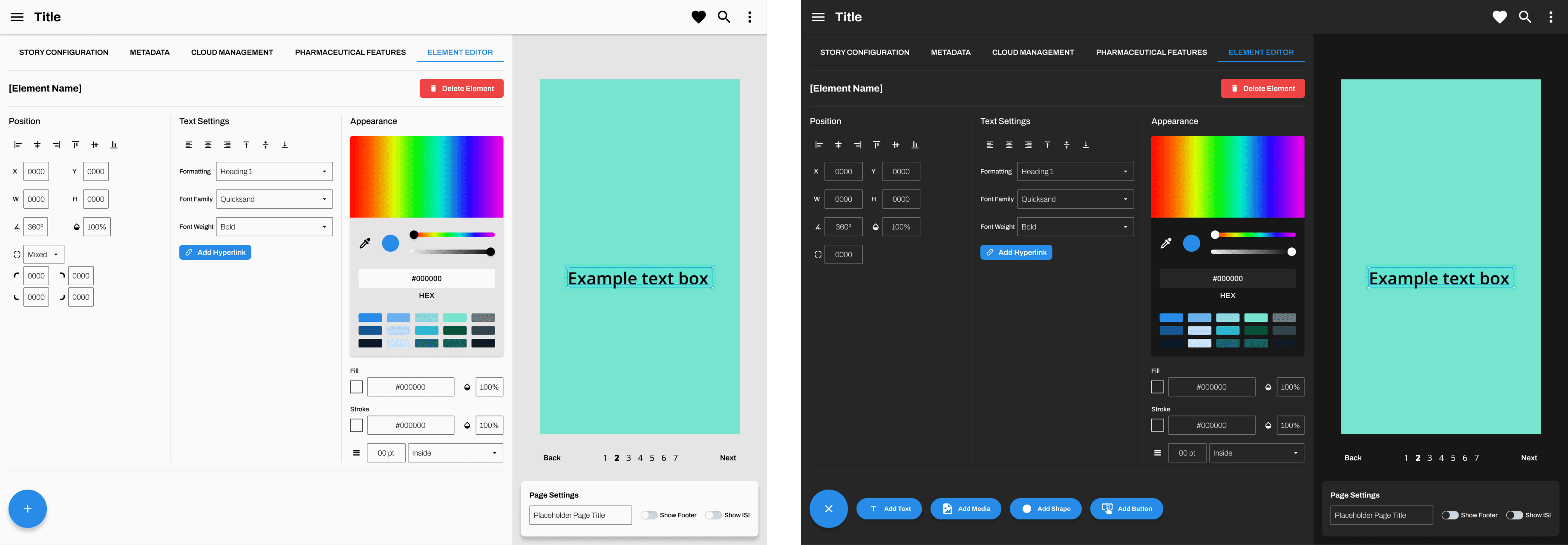
Using the dual sidebar layout as a starting point, the visual design was further fleshed out by using the chosen color palette, typography, and visual styles from the design system to create a cohesive and visually pleasing interface.
Refining visuals into a detailed prototype
Visual design
Using the dual sidebar layout as a starting point, the visual design was further fleshed out by using the chosen color palette, typography, and visual styles from the design system to create a cohesive and visually pleasing interface.
Adapting the design system
UI elements
Forking off the design system, custom UI elements were designed and implemented, such as action panels, input fields, and navigation menus, to ensure a consistent and intuitive user experience.
Adapting the design system
UI elements
Forking off the design system, custom UI elements were designed and implemented, such as action panels, input fields, and navigation menus, to ensure a consistent and intuitive user experience.
UX adjustments
User flows
With review of the high-fidelity prototypes, the user flows primarily around establishing animations and analytic tracking, were reconsidered and adjusted.
Process images below ↓
UX adjustments
User flows
With review of the high-fidelity prototypes, the user flows primarily around establishing animations and analytic tracking, were reconsidered and adjusted.
Process images below ↓

Heading into the development process
Product handoff
The handoff process was designed to facilitate a seamless transition from design to development, ensuring clarity, efficiency, and accuracy in bringing Storysoft’s Studio to life. By providing detailed documentation, including annotated designs, interaction specifications, and style guides, developers had ample references to accurately translate the high-fidelity design into functional code.
Heading into the development process
Product handoff
The handoff process was designed to facilitate a seamless transition from design to development, ensuring clarity, efficiency, and accuracy in bringing Storysoft’s Studio to life. By providing detailed documentation, including annotated designs, interaction specifications, and style guides, developers had ample references to accurately translate the high-fidelity design into functional code.
Continuation
Continuous releases
Once the MVP for Editor was completed, planning began for future updates and new features.

Primary Editor view: A flexible canvas for building content
Primary Editor view: A flexible canvas for building content

Footer button controls for pharma
Footer button controls for pharma

Important Safety Information controls for pharma
Important Safety Information controls for pharma

AI image generation
AI image generation

User settings
User settings

Upon login